


HAND-IN PAGE: VISUAL STUDIES
The village character concept
I must confess that I didn't split my time to have a nice period of concepting before starting all the modelling. That was because we had four weeks to make this project, however, the two first weeks were focused on learning new techniques; we spent one week modelling the headand another week modelling the body, and all of this before we even thought about our character concept - mainly because our models had to have our own real life proportions. We used our own face and body as references so we could start learning how to do the things before even thinking about the final result. As a result, at the end of week two, I had a face and a body, but had only two weeks left to think about the clothing, background, textures and rigging. I wish I could have created a lot more variations for my character and thought more on it as a playable character instead of a NPC.
From the start I had this reference board already set so I had a notion of what I wanted, but didn't have anything solid. When I started the sketching, I had to discard a lot of good ideas because It wouldn't be practical considering the amount of time I had left and the effort needed to make them look good!


I ended up choosing the second set of clothes as my official design, even though what I really wanted was to work with the third one. Regarding the hair, I know. I literally chose the most boring haircut ever. But god, I didn't have TIME to spend on modelling some nice horned-hair! It's important to say this was the first time I have created a 3D character EVER, so I literally had no idea of how to create hair or clothes or ~~HANDS~~. The hands were terrible.
At the end, the final result didn't look as bad as I thought. I kind of fell in love with the design and I care a lot about it to want to re-do everything the way it should be done. I wanted to make it look a lot more earthy and green. Like the character was cursed by a spell that was slowly turning her into a tree. So I wanted to make her fingers and feet with moss and this kind of thing. I had a really nice concept and couldn't execute it and show how awesome my character would be. Sigh.
Rendering in Photoshop
What exactly is a render version, after all? So far I have learned that if you press F10 in your keyboard, you can render your scene in 3Ds Max. For me, the verb To Render was specifically talking about 3D sofwares, but apparently I couldn't be more wrong. According to a definition I found, "Rendering is the process of add shading, color and illumination to a 2-D or 3-D wireframe in order to create life-like images on a screen". I should have looked at this before I spent half an hour listening to my tutor talk about rendering and having absolutely no clue of how the hell I would render something in Photoshop.
But hey, we are always learning! We were given the simple task to create a render for the four basic shapes, the cube, sphere, cylinder and cone. I started to get some problems from the start, given my limited knowledge on photoshop brushes and digital painting techniques, but I managed to finish everything and just struggled a little. Here are the four basic renders:


The following lecture was an introduction to complex renders, in which consist in applying basic render into complex objects. At the end, our final task was to choose between creating my own design of a car, airplane, gun or whatever and proper render it or applying the technique into a photograph of our own and creating objects in the scene. I chose the second option, and took a nice picture in a garden in Nottingham to work with. I had this idea since the beginning to make a caravan, and I had a lot of plans to my render, but at the end, we had some communication problems with the tutors, and what we thought that would be due in April, was actually supposed to be handed in at the last friday of February. I had to work on my piece fast as I never ever did, and had to leave behind a lot of initial ideas.
Because of the time I had to finish everything before the enhancement week, I might have cheated a little. I mean, not actually CHEATED because we had used this tool before in the Galleon Project so I didn't feel TOO guilty to do that again, but I know It was supposed to be the other way. Instead of creating all the details for the planks and wood in the scene, I took existing pictures of timber and manipulated to fit in my scene, I just didn't have time enough to hand paint everything and I had all my values ready already.
Giving the right value to everything was a slow process, but not a difficult one. I'm not sure if I got it 100% right, probably not, when I look at my drawing again I find it maybe too dark, maybe it lacks a little bit of contrast, but the overall looks okay considering I have never done something like this before and was completely terrified (I may have written this several times already, but It was true everytime, trust me). I really wish I had the time to add a nice set of table and chairs with lots of fabrics, some suitcases, luggages spread around the scene, it would look so different.


I also didn't have the opportunity to change the background and remove que signs and the buildings. So please disconsider that NOTTINGHAM written on the back of everything, It's kinda of killing the overall mood I wanted. Regarding the cloth around the scene, I managed to create a very realistic cloth in the tent, but when it came to the courtains on the door, I completely failed to be realistic.
The overall feeling I had with this project was that It could have been so much more if I had the proper time to do so. Despite of that, I'm pretty happy with the way It turned out, and I'm glad I chose to work with a photography instead of just creating an object in a grey background.
Village Mood Paintings
Before we start working as a team and creating our level in UE4, we were asked to take some screenshots of the original village file and make paintovers to create a different mood to the scene. The techniques we used for this particular project were mainly image manipulation to change the colours and play with different palettes and add some extra details to complete the scene. At this point I already knew I'd be in charge of the bunting to dress our festival-ish themed village, so I tried to experiment with some flags and lamps. I also wanted to make sure each of the sketches would have different colours, so I went to UE4 and took some nice screenshots. Here are the original images I had to work with:


Mostly I used tools like Hue/Saturation, Color Balance and Color Channel Mixer to change the colours and reduce lighted areas; from the point I had the overall mood set, I started making small changes in the sky, river and montains in the background. I tried to hide the montains to highlight the front area the most, and in my second sketch I gave it a little glow to the gems too. My first attempt was a simple night scene with some hanging chinese festival lamps and some magic orbs going around; It was the image I could play with the sky the most, even though I chose not to go so crazy with it. The second one turned out to be some kind of fairy magical environment with a lot of blues and purples, again with the orbs, glowing gems and pink nice lamps! The third one was a "after party" sunrise scene with buntings and a lot of colourful paper spread on the ground. For my final sketch I decided to make a lot of glowing lamps floating around like the light festival we all know. I didn't spend a lot of time on each one of these so they are pretty rough and poor, however, it was really nice to see how they changed from the original pictures, that's why I had all the originals here as well, so you can compare them.
Even though I knew we would be working with a dark environment, I decided to further develop the third sketch with the red and orange mood, because I thought there was the one with the most interesting story behind it. The problem I had with this further development was that I literally didn't have time to think or do something acceptable, because of some communication problems between us and the tutors. We were told we had one month to finish all of this but suddenly we were told we had one week to do everything, so I had to rush like never before and I was just so frustrated and with so much work to do in other projects that I just didn't care enough for this particular step of the village project. I did try my best with the short amount of time I had, but considering I'm terrible at digital painting and usually take ten times more to complete simple tasks, I don't think that was enough for a good result.


I tried to make the bunting a little more realistic, but I failed miserably with the ones in the first plane. Also I decided the glowing orbs were really nice so I decided to stick with them with this one as well, heh. I added some festival balloons, and I kept thinking about them after I had everything finished: It wouldn't make a lot of sense to have them floating around after the party had finished, but it wouldn't be very clear to the purpose of illustrating possible assets to have them on the ground with all the dirt. I would probably have to change some of the bunting to hanging lamps since our scene will be a lot darker than this, but I plan to have a LOT of bunting spread around between the houses and assets so It can be very clear that a festival was (or is) happening in there. The reddish aspect of the background has pleased me a lot, even though I could have used more shades of yellow and orange and maybe made the bunting colours a little more vibrant and cheerful.
Overall, this experience was very clarifying to me as an artist, and I did learn some techniques in photoshop for image manipulation. It's going to be really nice to gather all the mood paintings from all my classmates and have them together to pick some ideas. I was a little frustrated because I realized later that I could have placed more houses around the level and deleted some of the character planks that escaped my sight, and I would have had a more complex village, but that was just a shame. I didn't really know how to use Unreal and I would probably struggle a lot just to place another building in the scene! So it's okay I guess.
Galleon Project

I decided to work on the Galleon Project before going foward with the Diorama Project, and It took me three or four days to have everything done. I expected it to be very difficult because of the amount of digital painting involved, but at the end It was fine: I could manage to draw and paint all sillouettes and they all look decent! And what surprised me the most, my further development piece looks AMAZING. I. Am. So. Proud. Of. Myself.
During the four days I spent working, I've been uploading all my progress here, and If you give a quick look at my blog posts you can see all my struggle. However, as this is the final Hand-in page, I guess I should write a little bit more about my experience with this weird boat.
First of all, I have never, ever drawn a boat, galleon, ship or whatever in my whole life. First times are really scary, and I was expecting my sillouettes to be terrible, mostly because I had no background or life references for something like that. But hey, I went crazy and made a giant reference board with every flying galleon that caught my eyes on Pinterest. I even went to google images and tumblr to hunt those ships. At the end I had so many references, that creating shapes was actually a piece of cake!
The frustrating part of the sillouettes creation was that I had about 10 sillouettes during the lecture on Monday morning, but for some reason I forgot to save my file, and when I got back home,my file was back to only six galleons. I spent so much time with those sillouettes and I didn't have time to re-do everything, so I had to stick with the six I had. That being said, I was pretty happy with them.
The decal I chose to work with is, obviously, a unicorn. During the process I couldn't stop thinking about how a Galleon doesn't have anything to do with things I was used to draw, and I had to put something in there that would translate my identity, and what is better than a unicorn decal on a flying pirate galleon? Nothing, I tell you. Can you imagine the kind of pirate that inhabitates this ship?
The one sillouette I chose to go further with was the last one. I really liked the balloon but I wanted to have a lot of sails as well (mainly because Mike K. said he didn't want balloons but I was upstairs using the Cintiq room and totally didn't hear that. I asked him later what to do and he said It was alright, but I decided to put a lot of sails to make it up for the balloon). I came with these ropes going down the balloon, and this was the hardest part, because of the geometry and knots, but at the end It looks good!
In the left is the chosen sillouette I worked for the further project and the final development of my Galleon picture. Although is very simple and ruff, I am very happy with the final result. I had to change drastically the shape of the balloon because It looked very wrong and I had to look back at some references to get the right shape.
Also, I gave more depht to the sails and turned them around a little bit so they would show more the decal and the ropes. I added an anchor as well.
After I had the further development done, I started to model the basic shapes of the Galleon on 3ds Max, and It was a great experience because I didn't remember how to work with such organic shapes anymore, and making the sail was very fun. I didn't have much time for the block out, so my model looks very simple and not very detailed. But It does work for the project.
For the block-out, I had all the sails in different, vibrant colors so I wouldn't confuse any element during the lineart process, I think the most difficult thing was to model the boat itself and the sail on the botton of it. Everything else just came naturally, and I could have done a detailed, high poly resolution model If I had time to (It would certainly be a lot of fun and It would look great at the end). I took a print screen instead of using a rendered image, but only


because I could use a plane with wireframe as a perspective tool doing so. At the end of the lineart process, I decided not to add new elements like food barrels because I thought It would be too much, I did not have much space to work on the inside part of the galleon and decided to leave the way It was.
Now, the white brush with a stroke technique to create ropes more easily was just mind-blowing! It is such an easy and simple idea and yet so effective, It saved me a time that I can't even measure, I can't even think of how much work would it have been to draw every and each line of the ropes on the balloon individually. Mike K. also taught us to use the pen tool, and even though I was already familiar with It, I had some tricks added to my database.
Another new thing I learned with this project was to use an existing texture and apply it to the model using the distort modifier. I didn't know I could use a filter to find the lines of a texture and transform it into a lineart image. Even though they remain with a white background, It was not a problem.


If I was to give myself some feedback on my final lineart Galleon, It would be basically to practice more the perspective thing. At first It looks like something easy to get, but I did face some hairy situations here, and if I had a better notion of the subject maybe I wouldn't have struggled so much.
I think the rowings were the most difficult part, even more than the balloon ropes! I decided not to model them in 3Ds Max and I still don't know if that was a good or a bad idea, considering I had to put myself together several times to try to make them in the right perspective. I think It was even more difficult because It's a complicated shape. I mean, It doesn't look like It's complicated but having a cylinder connected to a rectangle confused my mind. At the end I think my attempt to get It right was a almost there.
Apart from that, I really think I did a good job. I don't think I could have done something like this without the blockout process, given my not so great abilities with perspective, and that switches on a red light in my head, but being able to do exactly was I was told to really payed off, altough my first goal was to make more than one perspective view of the Gallon, and I couldn't do that, the most satisfying thing was being able to finish all the projects due 10 of January in time, even though I was travelling for 12 days on hollidays. December was a month in which I spent most time locked in my room focused on my projects, and I had some weekends to travel around and rest my mind, otherwise I would have gone mad with all the things I had to do. I don't think I ever experienced a stress like this before, and I've been at an University for three years now! I think the most frustrating thing was having to spend christmas working. Hollidays for me are always hollidays, and I was always free of any uni work to enjoy this time with our families and friends, and having projects due to the first day of lectures after the break made me so mad. I think It would have been better for the deadlines to be the last day of lectures on December: we would have to work even more during the weeks, but at least we wouldn't need to worry about university projects when we were supposed to relax our minds from a stressfull first term.
Well, at least is over now. Sorry about the outflow.
Perspective studies on Photoshop
Throughout the first weeks of Visual Studies, we were introduced to Photoshop basic tools, and how to use perspective on our digital drawings. These lectures were also supported by Life Drawing lectures, in which we would practice perspective with pencils and paper using real life references. Each perspective, that being one, two or three point perspective has a specific technique to be drawn, specially on Photoshop, and that can be very tricky so I had to pay a lot of attention to what Mike K. was doing before I tried myself; thank god we have the tutorials on Blackboard.
We started drawing primitive shapes in an one-point perspective canvas, and the most interesting thing is that every shape starts with a cube or a rectangle! To make a perfect cube the only thing is to have the primary lenght segment the same size as the height segment, and I used the same measures to create three more cubes for the other primitive shapes. One ridiculous thing that I realised, is that you can't be a little smartass and try to move or copy the first cube in order to make the other shapes, since every centimeter changes the way the cube will look at the end. However, you can copy the front square of your cube and just give it the proper perspective when you move it. I discovered that in a very sad way, because I realised my cube was too big and I wouldn't be able to create three more, so I tried to rescale It and everything went wrong. I had to erase everything and start it all over again.

After I had four little cubes, I started to create the other primitive shapes, the cylinder, cone and sphere. The cylinder is a pretty easy shape after you have your cube or rectangle base, you just need to find the center point of the botton and top faces of the cube, as well as the median point of each segment of the two faces, and after that, create a circle for each face and use the transform tool to fit it center and side points in each square. Then you just connect both circles and you have your cylinder!
The same goes for the cone, but this time you only have to create a circle for the base, and them connect this circle to the center point of the top square. Come on, It can't get any easier!
Now, if you look at the image on the left, you may thing the sphere is like the craziest thing to build. Actually It's not, It just takes a little longer, because you need to find the center point of each face of the cube
in order to place the final sphere properly in the space. When you have all the center points, you create a square in the exact middle of your cube, and just like the cylinder and cone, you create a circle fitting this square, and that will be the center of your sphere. After you have the central circle, the next steps are very easy: you are going to create a perpendicular circle that goes from the middle point of the top face to the middle point of the botton face, fitting the central circle. And there you have your sphere!
After I had all four primitives, I created some other cubes around the space to see how the shapes would behave on and over the perspective line, but the work to build them was just the same, nothing new, nothing tricky, so I went to the other stretch goals to see what I could do with one point perspective.
What bothered me about the arches on the left is that, in order to make them I had to divide the front face in three so the arch would be exacly in the middle. I later remembered that in my first year at Uni back in Brazil I had some lectures on how to divide segments using a compass, and I could have used that here, instead of dividing the face in half several times. But It wasn't that difficult.
The other two structures were quite easy to do as well, but the top one was supposed to be a pyramid of cubes, but I started it wrong, I thought I could make an inverted pyramid but at the end I didn't know how, and It would have been better if I had this structure a little below so I could make other cubes on top of them. Well. Shame on me.
After I had all these studies, I went to the canal to make a life drawing, but all life drawings studies are in another page.
Then we started to practice the two point perspective! In fact, we started learning how to make a perfect square in two point perspective, which was actually more difficult than I thought It would be. After that, we created all the primitives (the cube, the cylinder, the cone and the sphere) and also learned how to rotate elements and create more complex elements like stairs.


Then we started to practice the two point perspective! In fact, we started learning how to make a perfect square in two point perspective, which was actually more difficult than I thought It would be. After that, we created all the primitives (the cube, the cylinder, the cone and the sphere) and also learned how to rotate elements and create more complex elements like stairs.
For this lesson I had to draw some everyday things in two point perspective using the primitive shapes. I was in my bedroom and picked some objects that I see or use everyday, like my keys, my camera, my mug that is also a pen case, my 3D-glasses and and my bag. I was not worried about the proportion between the objects (you probably figured that out since my keys are probably not the same size as my bag right). It would be impossible to draw some of the objects If I was worried about that.
What I noticed was that the first two shapes were the most difficult to draw, while the last two were really easy and quick. It was obvious to me how practice improves my perception of space, even if It's a 10 minutes drawing.

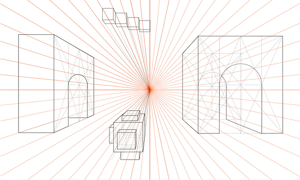
The next lecture introduced us to three-point perspective. I was reluctant at first because I thought It would be something really difficult, given the struggle to create a perfect cube in 2-point; happy surprise It was when I started creating the shapes and realised It was much easier than I anticipated! Not only very fun to make, the three point perspective make the shapes very, very imposing and monumental.
However, I found it much easier to work with the 3-point on photoshop than in paper, mostly because the vanishing points need to be placed out of the vision otherwise the shapes will get really distorted, and working with non-visible vanishing points when they don't fit your paper is crazy, man. Mike K. gave me some tips and taught me a "cheat": set a measure like 1cm for the bottom lines and 2cm for the top lines, and connect them to give the same effect. It was really, really helpful.

I made this crazy set of rectangles and cubes to understand better the distortion and effect on different places of the canvas, It was really fun to have those shapes near the vanishing points almost "falling" because they look so, so inclinated!
I also made a composition with all primitive shapes and a composition that looks like a city with many buildings that you can see below. I had some trouble with the sphere, because as you can see, It looks a little squished like an egg... It happened with most of the students and Mike K. explained It was not wrong but we should probably try to make it look better even though not following the perspective strictly. I think the 3-points perspective is the one that I enjoyed the most practicing, followed by 1-point and 2-points. I think the perfect cube thing on 2-points scared me a little. However, I'm very excited to start making my own environments and objects using this perspective, and I really want to have more works using this.

